01
Bright low-detail scene
Include sky, white clothing, pale studio backgrounds, or bright interiors. A light watermark can disappear here even when it looked clear on a dark editing-interface preview.
Watermark readability testing
Test watermark visibility on light, dark, detailed, and low-contrast photographs with a fixed review set and the actual published client gallery.
Quick answer
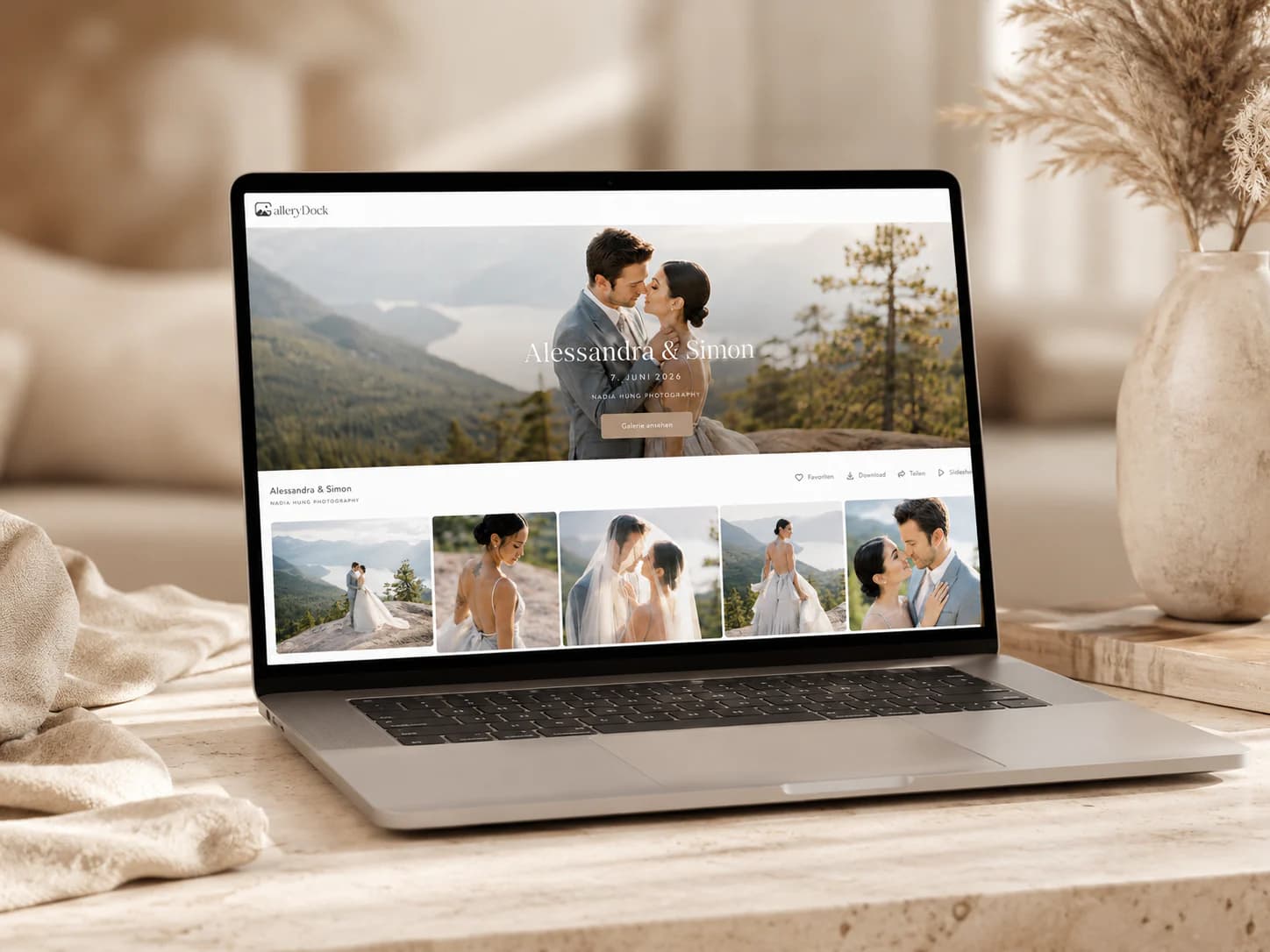
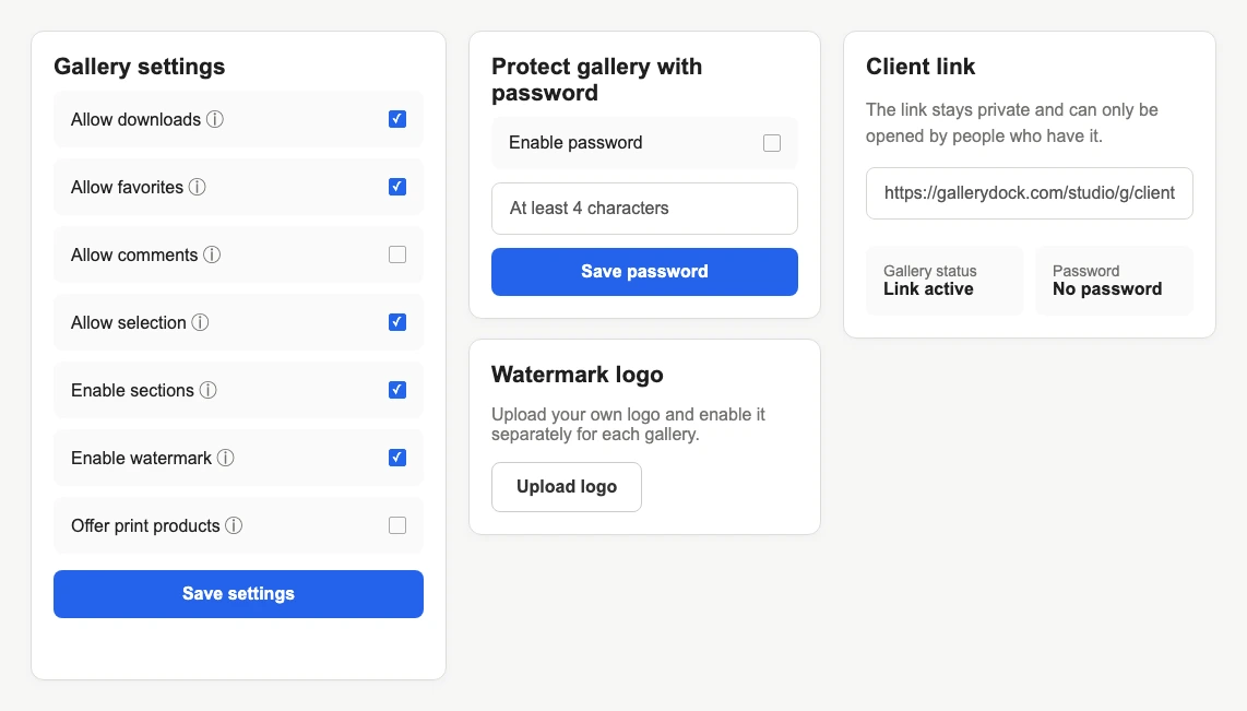
Watermark visibility should be tested on a representative set of photographs, not on one convenient hero image. Select light, dark, detailed, low-contrast, portrait, and landscape examples from the kind of assignments you actually deliver. Apply the same prepared logo and review the rendered result in the signed-out client gallery on desktop and mobile. Look for disappearing edges, unreadable fine text, excessive visual weight, and placement over faces or critical product detail. GalleryDock applies the uploaded watermark logo as part of its preview workflow; it does not analyze each photograph, switch between light and dark artwork, or automatically optimize position and opacity per image. The photographer remains responsible for the chosen asset and the final client-view check.
Test set
A useful test set reflects the extremes and common conditions in paid assignments.
01
Include sky, white clothing, pale studio backgrounds, or bright interiors. A light watermark can disappear here even when it looked clear on a dark editing-interface preview.
02
Use a night image, black backdrop, dark suit, or shadowed interior. A dark mark may vanish while a bright mark becomes visually dominant if its shape is too large.
03
Test foliage, crowds, detailed architecture, patterned clothing, or product labels. Fine logo strokes can merge with texture even when overall brightness appears suitable.
04
Include faces, key products, typography, and important negative space. Readability is not successful if the mark blocks the content clients need to review.
Review method
Change one variable at a time so the decision remains explainable.
01
Use the same representative images for every light, dark, or simplified logo variant. A fixed benchmark prevents a favorable image choice from hiding a weak treatment.
02
The same watermark can feel balanced on a large display and overpowering on a phone. Review the published gallery at both widths, not only the owner preview.
03
If thin details disappear, simplify the logo artwork before making the entire mark larger. Increasing scale can create new obstruction without restoring tiny internal details.
04
Document which logo file passed the test and why. This prevents an older version, opaque background, or unapproved color variant from returning in a later gallery.
Product boundary
Automation does not replace the photographer's responsibility for the rendered result.
01
GalleryDock does not inspect every photograph and calculate whether a dark or light watermark has enough contrast. The photographer chooses and tests the source artwork.
02
The product does not alternate between light and dark logo files according to image content. Use a treatment that works acceptably for the planned set or adjust the workflow.
03
The system does not identify faces, products, or text and move the watermark around those subjects. Review whether the visible placement obstructs assignment-critical detail.
04
A readable watermark can communicate proof status and deter casual reuse, but it cannot prevent screenshots, external capture, cropping, or every unauthorized use.

Comparison
The best treatment stays useful across the real gallery without claiming automation that is not present.
| Approach | Best for | Tradeoff |
|---|---|---|
| Light logo | Mostly dark photographs | Can disappear on bright scenes |
| Dark logo | Mostly bright photographs | Can disappear in shadows |
| Simplified mark | Small preview rendering | May omit a full brand tagline |
| Larger mark | Stronger visible proof signal | Can obstruct important content |
| No watermark | Clean final presentation | Requires other workflow communication |
The photographer checks white dresses, dark suits, dim reception frames, daylight portraits, and detailed dance-floor photographs before approving one proof mark.
The studio evaluates the watermark against packaging text, reflective surfaces, white sweeps, and dark products so the client can still inspect commercial detail.
Bright windows, shadowed interiors, textured facades, and clean walls expose different contrast failures while placement must avoid design-critical lines.
Frequently asked questions
Photographs vary in tone, color, texture, and subject placement. One logo treatment can have very different local contrast across the set.
No. It does not analyze each photograph or select a different watermark variant automatically.
Only after checking whether simplified artwork solves the problem. A larger mark may hide important client-review detail.
Include bright, dark, detailed, low-contrast, portrait, landscape, and subject-critical examples from real assignment types.
Inspect the published signed-out client gallery on desktop and mobile, not only the uploaded logo preview.
No. It is a visible workflow signal and deterrent, not DRM or a guarantee against screenshots and external capture.
Related resources
Pricing
Free forever
0 EUR
EUR 0 per month
Perfect for sharing your first galleries professionally.
Start free, no credit card required
Monthly
19 EUR
EUR 228 billed yearly. plus VAT
Ideal for photographers who regularly deliver client galleries.
For regular client delivery
Monthly
29 EUR
EUR 348 billed yearly. plus VAT
For photographers managing many projects, videos and growing storage.
For regular client delivery
Use consistent artwork, compare tonal extremes and busy scenes, inspect desktop and mobile, and record the source file that passed.
Create a free account