01
Name the intended tone
Decide whether the image should look neutral, warm, cool, or deliberately toned before treating visible color as an error.
Black-and-white print checks
Separate intentional toning from an unwanted color cast by checking the source, export, display, viewing light, and reference print before selling the series.
Quick answer
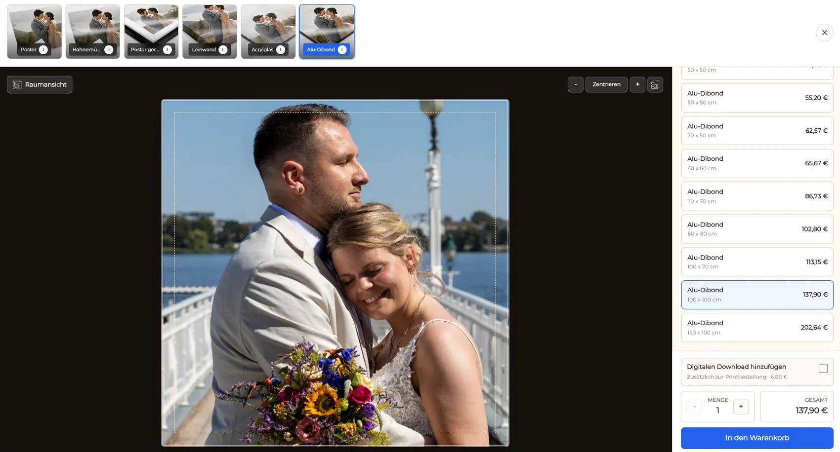
An unwanted color cast in a black-and-white photo print can come from more than one place. The source file may contain intentional warm or cool toning, an export may differ from the master, the display may be misleading, the viewing light may change the paper's appearance, or the physical reference print may reveal a production issue. Diagnose these stages separately instead of making random corrections after one glance. First define whether the photograph is meant to be neutral, warm, or cool. Compare the master and output file, review the image on a dependable display, and inspect a reference print under suitable light. Correct a file problem in the external editing workflow before publishing the revised source. GalleryDock then presents the prepared monochrome series, products, sizes, crop, room preview, cart, and checkout; it does not perform color correction, manage ICC profiles, or provide a color-contract proof.
Intent and file
Neutral monochrome, warm toning, and cool toning are different creative targets, so the expected result must be explicit.
01
Decide whether the image should look neutral, warm, cool, or deliberately toned before treating visible color as an error.
02
Open the prepared master and the exact output file and check whether the cast already appears before upload or printing.
03
Use known gray, white, skin, sky, architecture, or background areas to locate a consistent unwanted tint without ignoring the creative grade.
04
If the file contains the problem, fix and export it in the photographer's editing workflow before replacing the gallery source.
Display and light
A monitor or light source can change the perceived result even when the underlying file has not changed.
01
Compare the file on a second suitable display before assuming one monitor represents the prepared output accurately.
02
Inspect the print away from strongly colored walls, mixed lamps, or rapidly changing daylight that can influence perception.
03
Compare reference prints under a repeatable viewing condition so a new observation can be distinguished from a lighting change.
04
Look for whether the same tint appears in the export, only on one screen, only under one light, or consistently in the physical print.
Gallery offer
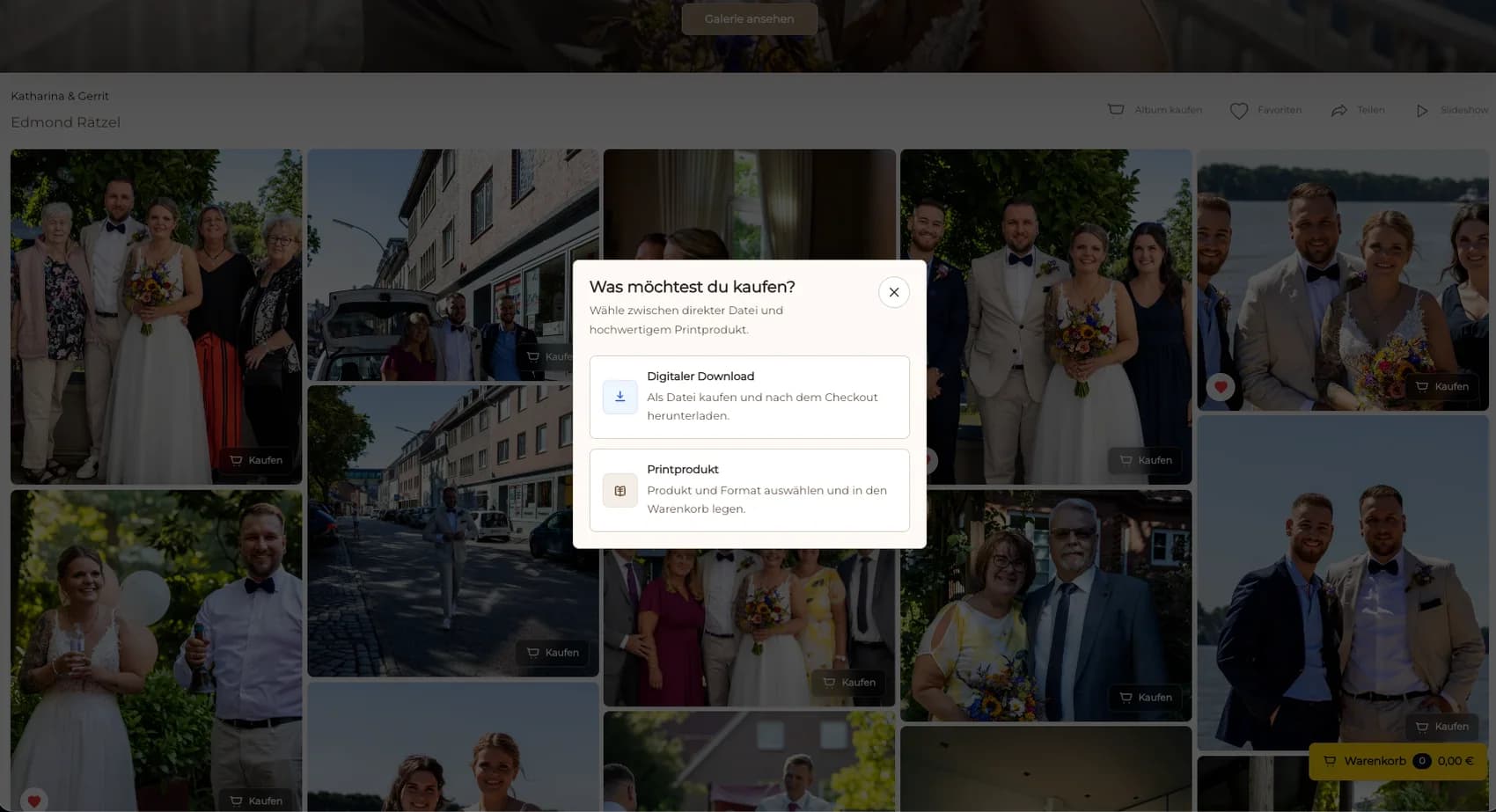
GalleryDock carries the prepared photograph through product selection and ordering but does not replace the photographer's color workflow.
01
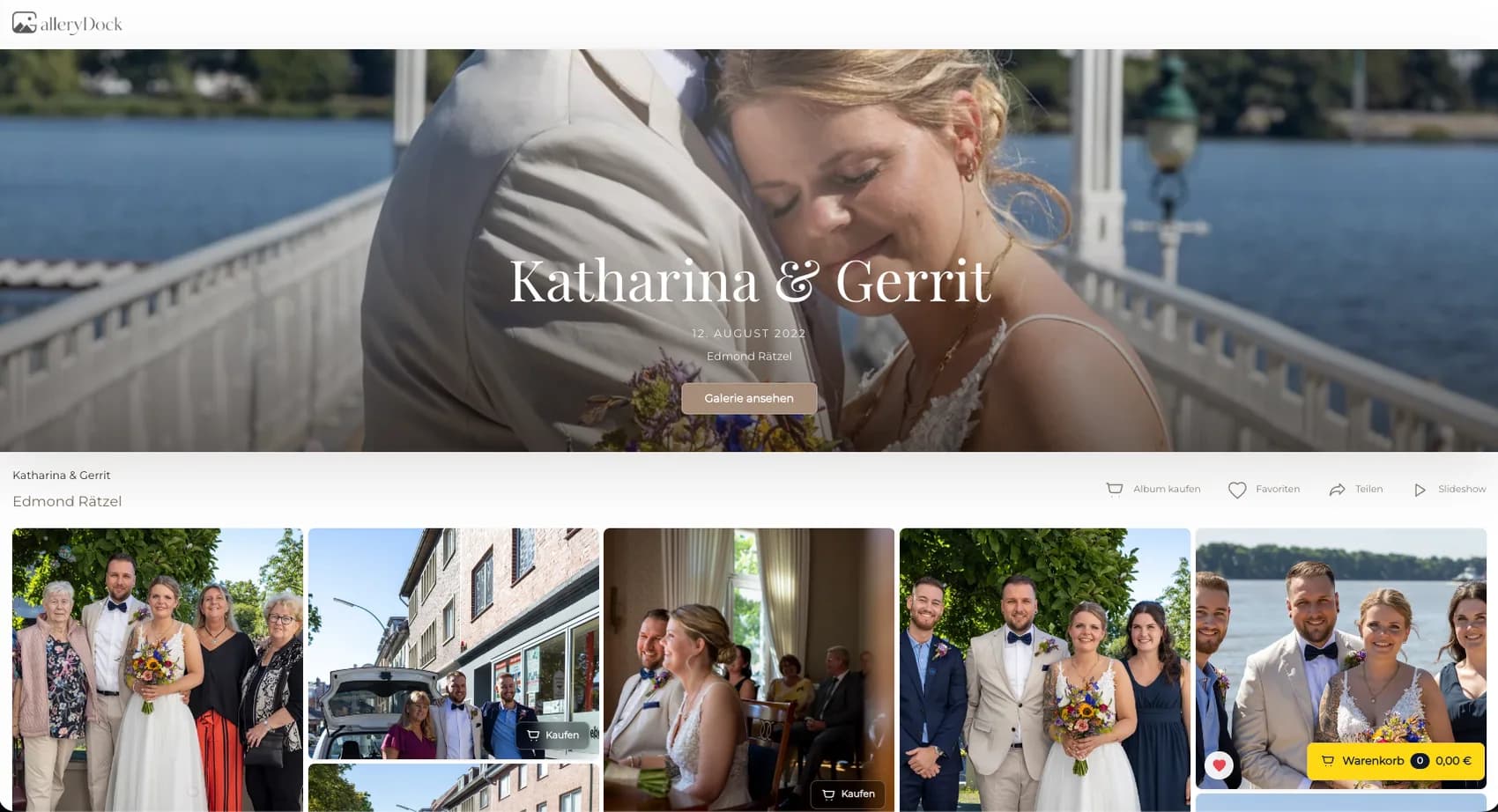
Upload the approved output after the external correction and verify that the intended monochrome version is the one shown in the gallery.
02
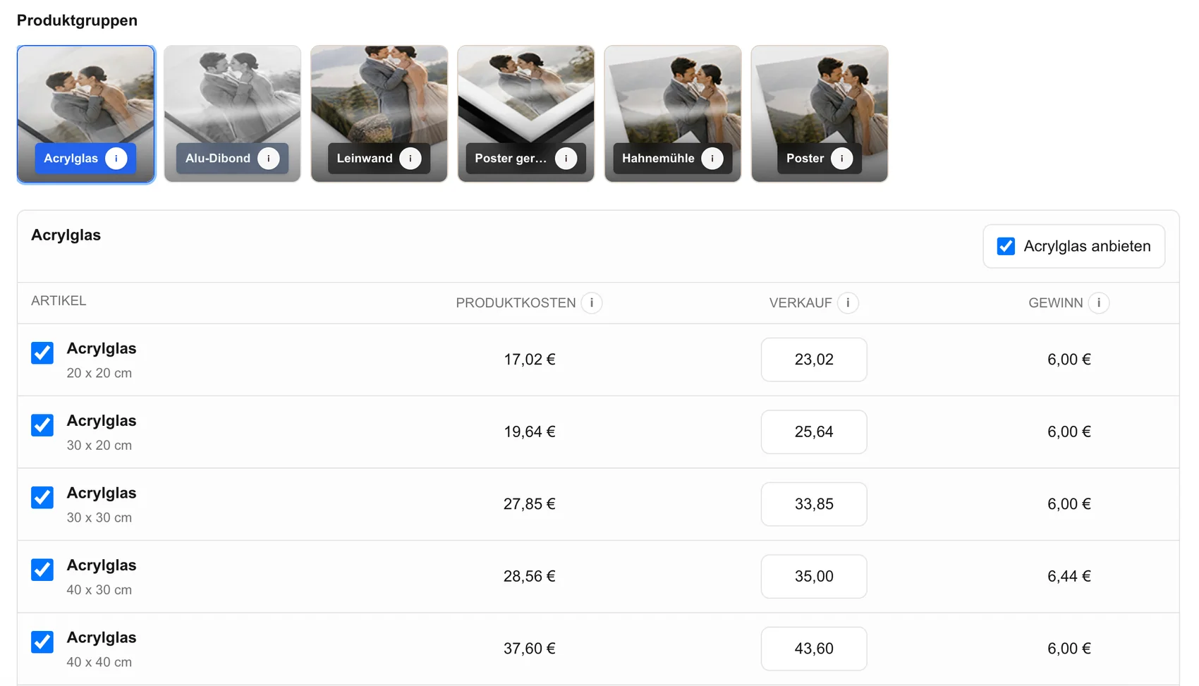
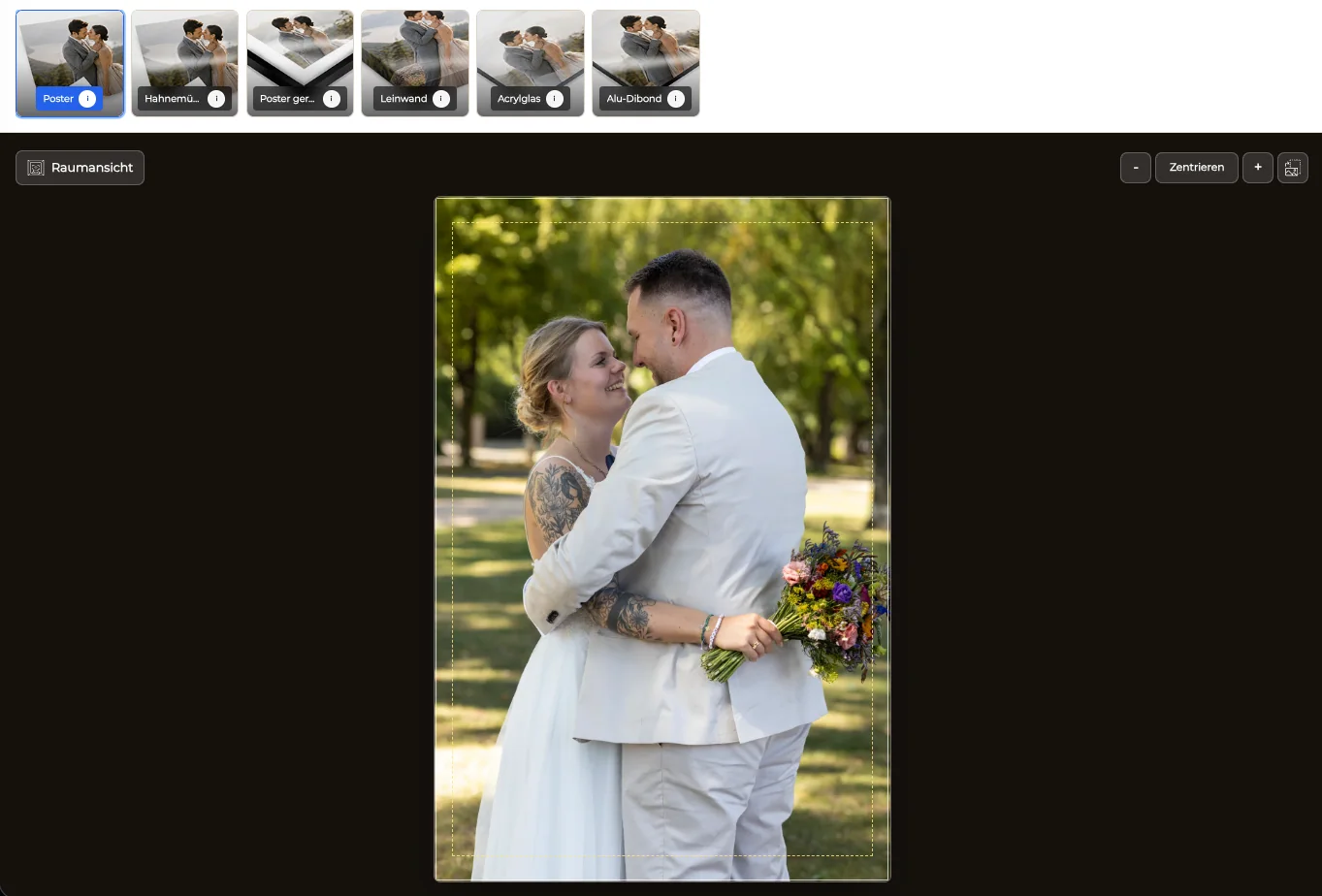
Activate a focused set that suits the finished series and check how large tonal areas behave in the visible preview.
03
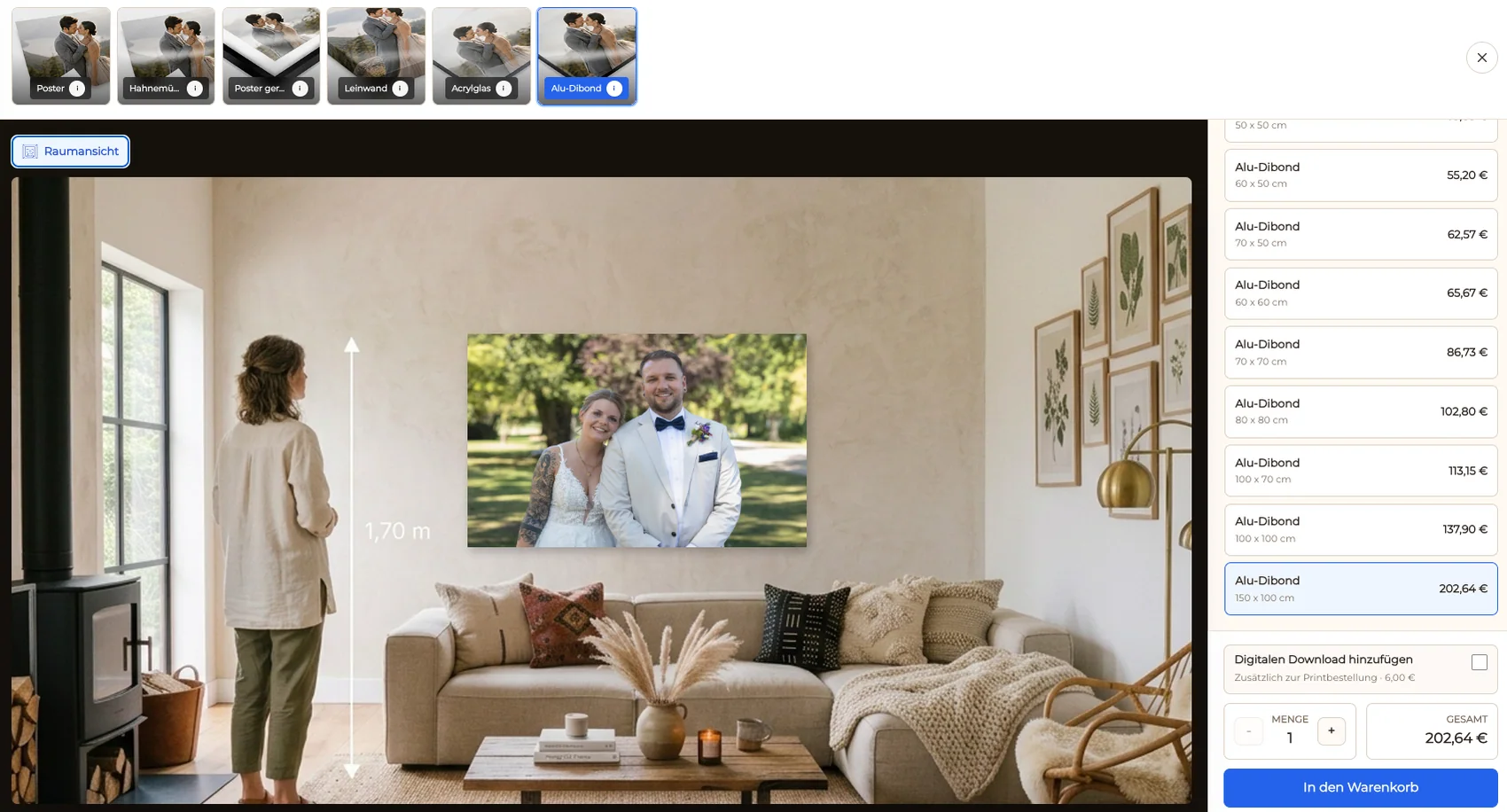
Confirm that orientation, crop, safe area, and wall scale preserve the composition and intended tonal emphasis.
04
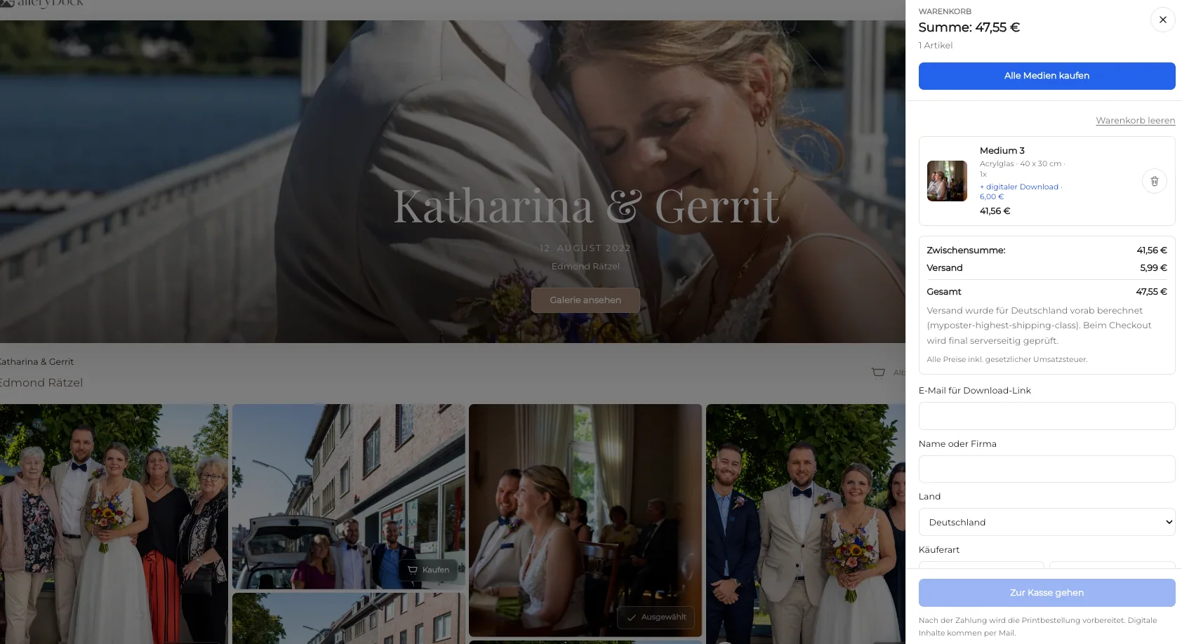
Complete a realistic public selection so the prepared photograph, product, size, quantity, and price remain connected through the order.
Comparison
Change one variable at a time so the next correction is based on evidence rather than guesswork.
| Approach | Best for | Tradeoff |
|---|---|---|
| Intentional toning | Warm, cool, sepia, or split-toned style | Must be distinguished from an unwanted shift |
| Source or export issue | A cast visible across dependable displays | Needs correction and a new export outside GalleryDock |
| Display issue | A cast visible on one screen | The monitor view may not represent the file reliably |
| Viewing-light issue | A print that changes under different light | Perception depends on the environment |
| Reference print check | Evaluating the complete physical result | Applies to the tested configuration, not every future condition |
A skin-tone portrait is intended to remain neutral, so the master, export, display, light, and reference print are compared in order.
A deliberate warm grade is documented so the photographer does not remove the creative tone while troubleshooting an unrelated display shift.
Large neutral surfaces reveal whether a tint follows the file, one monitor, one light source, or the tested physical print.
Frequently asked questions
The perceived tint may come from intentional toning, the source or export, one display, the viewing light, or the tested physical print, so each stage should be checked separately.
Define the creative target first and compare the master, export, and known neutral areas before changing the file.
Use a suitable, repeatable viewing condition and avoid mixed or strongly colored light when comparing reference prints.
No. Color correction and output preparation happen in the photographer's external editing workflow before the approved source is published.
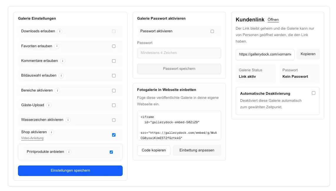
GalleryDock presents the prepared series and connects each photograph to products, sizes, crop preview, room view, cart, and checkout.
Related resources
Pricing
Free forever
0 EUR
EUR 0 per month
Perfect for sharing your first galleries professionally.
Start free, no credit card required
Monthly
19 EUR
EUR 228 billed yearly. plus VAT
Ideal for photographers who regularly deliver client galleries.
For regular client delivery
Monthly
29 EUR
EUR 348 billed yearly. plus VAT
For photographers managing many projects, videos and growing storage.
For regular client delivery
Define the intended tone, test file, display, light, and reference print separately, then publish the corrected source and verify the order path.
Create a free account